
Hello!
Ask me any question about Lympik.
Please be as specific as possible so I can help you better.
Analyze OCULUS data
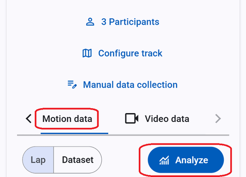
Once OCULUS has finished uploading your data, it will be ready for analysis in the web app immediately. To analyze it, simply click on the "Motion data" menu item. Here, you can see an overview of the data recorded by your tracker, which you can display by round or data set. You can also filter the data by athlete or lap. Click on "analyze".
If you are using the Oculus tracker as a stand alone device, please continue with the next lesson.
Then select a run you want to analyze and click somewhere on the map to confirm. All the collected data will now be shown in a graph and on the map for different analysis possibilities. You could also choose two or more different runs. Only recognized and analyzed runs will appear in this list.
The map and graph can be set to distance or time and shows speed as well as acceleration. If you choose two runs, they can be displayed in absolute values, or as the difference between the run and the reference run (black line).
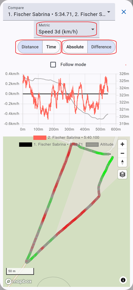
Speed to time analysis shows the speed difference at the respective time. You can view the respective position at the time in the map. Move the cursor over the graph to make the two athletes virtually ride the track again.
Speed to distance analysis compares the speed based on the position of the respective run. This provides a better opportunity to identify speed differences at certain points.
When comparing different runs in "difference-mode" (not absolute values) there is a color gradient that shows which run was faster/slower at a certain point of the track.